DISCLAIMER: Two Worlds, Two Cinematographers, and One Unified Color Language
How do you bring together two worlds photographed by two different cinematographers without losing either artist’s visual signature?
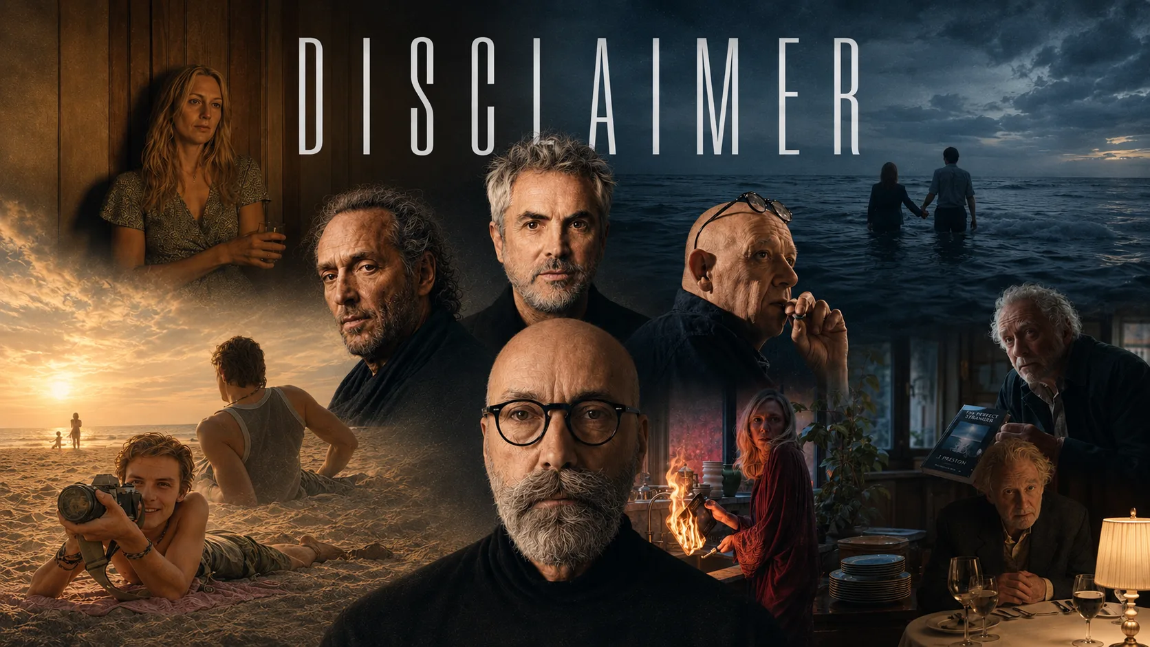
This was the central creative and technical challenge behind Alfonso Cuarón’s Disclaimer.
Director: Alfonso Cuarón
Directors of Photography: Emmanuel “Chivo” Lubezki, ASC, AMC, and Bruno Delbonnel, ASC, AFC
Colorist: Peter Doyle
A Camera That Wasn’t Ready Yet
Peter Doyle began camera testing in late 2021. Lubezki and Delbonnel were preparing to shoot with ARRI’s new Super 35 camera, which was still in beta and would later be introduced as the ALEXA 35.
ARRI’s specialists were still finalizing the camera’s calibration parameters on set, while FilmLight built the SDK required for the beta camera almost overnight.
DIT Peter Marsden handled color, calibration, and monitoring, while Lubezki and Delbonnel used the tests to develop their respective lighting approaches.
Cuarón’s position was clear:
“We are making a feature film—just a long one.”
One Project, Multiple Display Formats
The team was required to deliver an HDR master to Apple with a Dolby 709 trim, while preserving the ability to create Rec.709 and DCI versions for other presentation and festival contexts.
After extensive testing, the final grade was completed in HDR, while on-set monitoring and editorial remained in SDR.
The entire production was built around a fully color-managed set-to-screen workflow. Visual decisions approved on set had to remain consistent through editorial and final color grading. The purpose of the final grade was not to create the look from scratch, but to unify and refine an image that had already been carefully developed.
The project used an ACES workflow with a custom IDT created to transform ARRI Wide Gamut 4 into ACES. Through BLG files, the VFX department received an image very close to the graded result without permanently baking the grade into the footage.
Two Distinct Visual Worlds
Bruno Delbonnel photographed Stephen’s story, while Emmanuel Lubezki created Catherine’s world.
The two cinematographers worked without seeing each other’s footage. They used separate lighting packages, lenses, LUTs, and visual approaches. Their main shared technical foundation was the same ARRI camera.
Delbonnel photographed his material with ARRI/Zeiss Master Prime lenses, while Lubezki worked primarily with Leitz Summilux-C lenses. The softer Summilux-C lenses gave Catherine’s world a less contrasty and less sharply defined quality, while the Master Primes created a crisper, more pronounced image for Stephen’s story.
Cuarón and Doyle’s guiding idea was for Catherine’s world to feel elegant and refined, while Stephen’s was more suburban, weathered, and unpolished. There also needed to be a clear visual distinction between past and present.
The Colorist Between Two Worlds
Peter Doyle’s task was not to make the two images look alike. He had to preserve each cinematographer’s individual visual language while ensuring that the project did not feel like two unrelated films.
Delbonnel has explained that he never saw Lubezki’s work, while Lubezki never saw his. Peter Doyle and Alfonso Cuarón were responsible for maintaining the connection between the two worlds.
According to Lubezki, Doyle succeeded in keeping everyone’s ideas within a single cohesive vision:
“I wouldn’t say that he made us look the same, but the film had its own language, and Peter and Alfonso were responsible for that.”
Delbonnel described this approach as “a different kind of consistency.” Doyle understood which directions to avoid without requiring lengthy explanations because he had a clear plan for the entire project.
Doyle describes his working method this way:
“My approach to color grading always begins with understanding what the cinematographer is trying to achieve through lighting, what the director wants to draw from the performances, and what kind of world the production design has created. My role is to interpret all of that as accurately as possible—and then bring my own suggestions to the process.”
The central craft lesson of Disclaimer is simple: consistency does not always mean sameness.
When a project contains different visual languages, the colorist’s role is not to erase those differences. It is to create the invisible framework within which they can remain distinct while still serving one unified story.